Build an operations dashboard that leads to useful decisions
Build an operations dashboard around real decisions, defined measures, data freshness, case-level actions, and a practical small-team pilot.
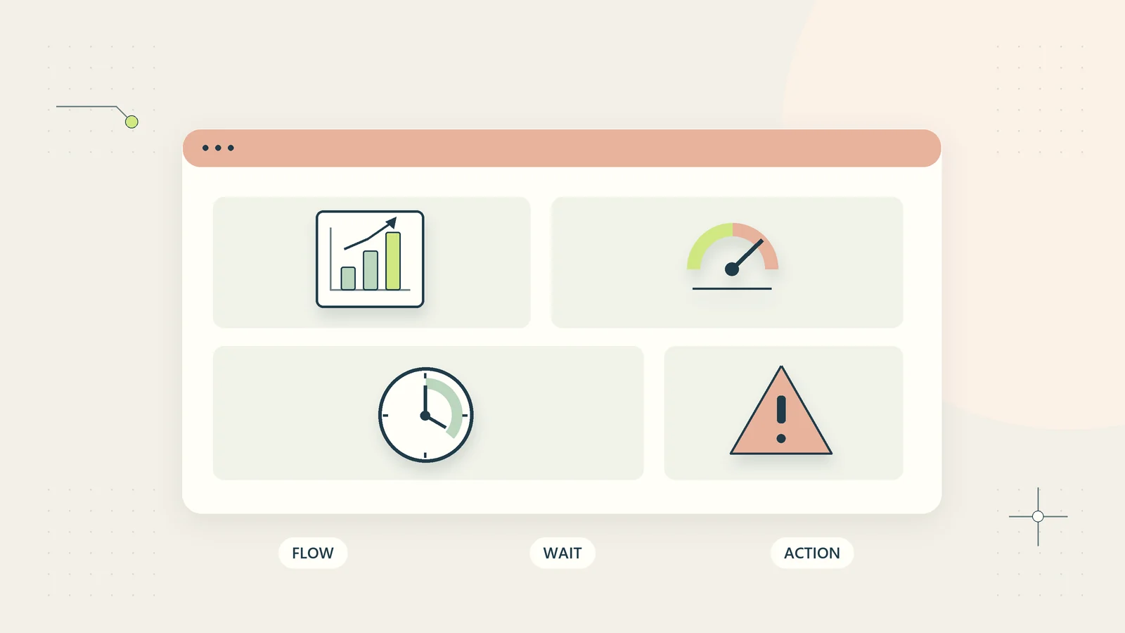
An operations dashboard earns its place when it helps someone make a better decision about work. A page full of charts can look impressive while leaving the team unsure which customer needs attention, what is blocking delivery, or whether the underlying records are current.
For a small business, a useful starting dashboard is usually a compact decision surface: a few measures, the cases behind them, and clear action owners. It can live in an existing spreadsheet or work register. Connecting more tools comes later, after you know what each number means.
This guide explains how to design that surface around everyday operating decisions. It includes a metric worksheet, an illustrative dashboard, data checks, and a pilot that tests whether the dashboard changes useful behavior. It does not assume that another subscription or an elaborate analytics project is necessary.
Start with the decision, not the chart
Write down the decisions you expect to make each day or week. Examples include reallocating a reviewer, following up on an unanswered request, delaying a new commitment, or correcting an incomplete handoff. Choose a specific operating process rather than trying to summarize the entire company on one screen.
For every proposed chart, finish this sentence: “When this changes, this person will consider this action.” If you cannot finish it, the measure may belong in background reporting rather than the main dashboard.
A chart showing total tasks ever completed rarely answers a current operating question. A list of accepted requests with no owner may immediately identify work that needs intervention. Both are data, but they serve different purposes.
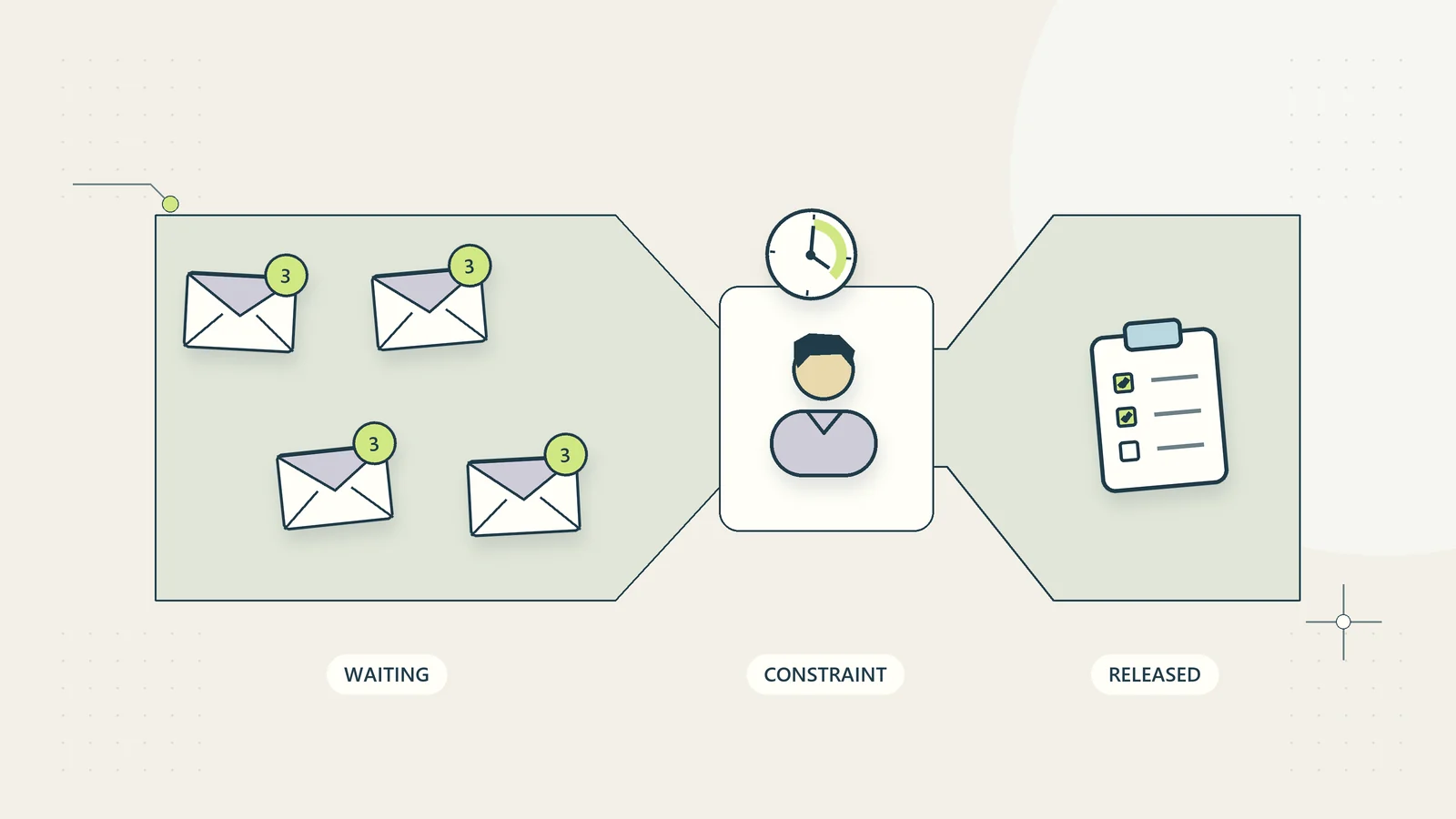
The process bottleneck guide can help identify which waiting points deserve visibility. A dashboard should support the process you actually operate. Drawing a sophisticated view of an inconsistent workflow will not make its definitions consistent.
Give each measure a written definition
A metric name is not a definition. “Overdue” could mean past the original requested date, past an accepted commitment, or outside an internal target. Those are different conditions and can produce different actions.
Create a metric dictionary with a plain-language definition, calculation, source, update schedule, and owner. Include exclusions and a warning about interpretation. Make this reference available from the dashboard so that a new team member can understand the numbers without asking the author.
| Measure | Definition questions to resolve |
|---|---|
| Open work | Which states count, and are cancelled requests excluded? |
| Work age | From receipt, acceptance, or the start of active work? |
| Waiting work | Waiting for whom, and does the record name a next action? |
| Completion time | Which starting and ending events produce the duration? |
| Reopened work | Is this a correction, a changed request, or a new instance? |
| Unassigned work | Is there genuinely no owner, or a missing name in the data? |
Distinguish elapsed time from handling time. An item waiting overnight can have a long elapsed duration and little active effort. Both may matter, but they diagnose different problems. Consistent definitions matter more than adopting the exact vocabulary used by another company.
Choose a balanced set of operating signals
Begin with a small combination of demand, flow, quality, and exceptions. Demand explains what is arriving. Flow describes movement and waiting. Quality shows whether completed work remains useful. Exceptions point to cases that need judgment.
For a project setup process, a first view might show incoming accepted projects, unassigned setups, waiting setups by reason, oldest active items, and records returned for missing information. Add a short list of decisions awaiting approval rather than turning every possible field into a separate chart.
Avoid ranking employees by raw completion counts. Task complexity, interruptions, review responsibilities, and working hours may differ. A simplistic ranking can encourage people to choose easy work or close records prematurely. Use process measures to improve the operating system before drawing conclusions about individual performance.
Atlassian’s current discussion of agile metrics includes cycle time and cumulative flow as ways to understand delivery. A small service business can borrow the idea of observing work movement without copying software-team estimation methods or comparing incompatible measures across teams.
Show the distribution behind an average
An average completion time can hide a small set of old, unresolved cases. If ten simple requests finish quickly while one important request remains stuck, a favorable average may conceal the case a customer most needs you to address.
Show individual aged items alongside a summary. Group them into meaningful service types or priority categories if those categories have stable definitions. A small team often learns more from the oldest five records than from a complex aggregate chart.
If you use a median or percentile, explain what it represents and show the number of observations. A percentile calculated from a tiny or heavily filtered sample should not be treated as a dependable service promise. Keep long-running open cases visible even though they do not yet appear in completed-work calculations.
Record meaningful changes in workload. A month containing a different mix of services is not directly comparable to an earlier month just because both have four weeks of data. Add context about unusual demand, staff absence, or a changed procedure so that the dashboard supports interpretation rather than inviting an automatic conclusion.
Design an action table beside the numbers
The dashboard should let a reader move from signal to case to action without reconstructing the situation from several private messages. Include identifiers, current owners, next actions, and links to the authoritative record. Keep sensitive customer information out of broadly visible summary screens.
| Signal | Case information needed | Possible operating response |
|---|---|---|
| Unassigned work exists | Receipt time, service type, intake completeness | Assign or clarify eligibility |
| Waiting queue grows | Waiting reason, request date, next follow-up | Resolve a shared dependency |
| Rework increases | Correction category and procedure version | Inspect instructions or input quality |
| Oldest item is unchanged | Last meaningful event and decision owner | Escalate the specific blocker |
| Demand exceeds available effort | Accepted commitments and realistic capacity | Replan the intake or delivery sequence |
These are prompts for judgment, not instructions to change a customer promise automatically. An urgent-looking number may reflect a data error. The person acting should verify the case before sending a message, changing access, or making a financial commitment.
Build a hypothetical first dashboard
Imagine a fictional consultancy that prepares implementation plans for customers. Its shared work register contains a request identifier, accepted date, owner, state, waiting reason, next action date, and delivery acceptance date.
The first dashboard has three sections. “Needs ownership” lists accepted requests without an owner. “Needs a decision” shows exceptions waiting for the service lead. “Flow this week” shows arrivals, accepted completions, and the oldest active cases. A small note gives the update time and explains that completed work requires delivery acceptance.
During this hypothetical example, a request appears nine days old. The case record shows that the team requested a missing source document, but nobody recorded the next follow-up. The useful response is to assign that follow-up and check the customer context. Merely changing the dashboard’s color threshold would not resolve the problem.
Another record has an impossible negative duration because its imported acceptance date used a different date format. The team excludes that duration from the summary until the source is corrected and records the exclusion. It does not silently convert the number to zero.
The design is deliberately modest. Its usefulness would need to be measured in the consultancy’s own pilot. None of these fictional numbers represents a promised reduction in delivery time or an observed client outcome.
Make data freshness and missing data visible
Display when the underlying records were last updated, not merely when the dashboard page was opened. A refreshed page can still show yesterday’s source data. If multiple sources update at different times, label them individually or make the oldest relevant update visible.
Treat missing information as its own condition. A blank owner is not the same as an owner named “unassigned,” and a missing completion date is not necessarily an unfinished task. Decide how the dashboard handles each case and flag records that cannot be interpreted safely.
Check a sample of dashboard values against source records before relying on the view. Include a normal record, a cancelled record, a reopened item, a waiting case, and an item crossing a month or time-zone boundary. Simple test cases often reveal more than scanning a large total.
If the process uses recurring instances, confirm that each instance is counted once. Copying a template, reopening a task, or importing the same file twice can inflate activity. The recurring task management guide explains why a stable task definition and a unique occurrence need to remain distinct.
Set thresholds as review triggers
Choose thresholds that support an operating decision, and explain why they exist. A threshold can reflect an accepted service target, a known dependency, or an early warning chosen for a pilot. It should not acquire the status of a customer commitment merely because it appears in red.
Avoid applying one age threshold to every service. A simple information request and a complex reviewed deliverable may have different normal cycles. Use a few understandable categories rather than a maze of exceptions that nobody maintains.
Pair thresholds with a response owner. “Three old cases” is useful only if someone checks whether to follow up, reassign, or renegotiate a commitment. Escalation should identify the reason and the required decision; broadcasting the entire dashboard to more people usually creates noise.
Review false alarms and missed alarms. If a threshold repeatedly highlights harmless cases while urgent exceptions stay hidden, change the definition. Keep a brief version history so that a trend break caused by a new calculation is not mistaken for an operational improvement.
Use the dashboard in a short operating routine
Decide who reviews which section and when. A daily owner check can focus on unassigned work and near-term decisions. A weekly process review can examine recurring waiting reasons and corrections. The same person does not need to inspect every metric every morning.
Record decisions in the work register rather than a separate collection of meeting notes. A dashboard review that produces an owner and next action for a specific case is easier to follow through than a general discussion about being more responsive.
Do not use the review to read every number aloud. Ask what changed, which changes matter, and whether an action is already underway. If a measure never affects a decision across several operating cycles, remove it from the main view or clarify its purpose.
Link recurring problems to a continuous improvement routine. The dashboard can identify a pattern; a small improvement experiment can test a response. Keeping those roles separate prevents every fluctuation from triggering an unplanned process redesign.
Protect access without making the view unusable
Give people the information they need for their decisions. An owner-level summary may need workload and unresolved exceptions without exposing private customer documents, employee details, or payment information. Use identifiers and controlled links where detailed evidence is necessary.
Apply access rules to exports and shared screenshots as well as the live dashboard. A carefully restricted source can still leak information through a broadly shared report. Include dashboard access in normal role changes and offboarding reviews.
Keep a recovery route for an unavailable dashboard. The authoritative work register should remain usable, and the team should know where to find urgent open cases. A dashboard that becomes the only undocumented route to critical information adds fragility to the process it is intended to clarify.
Document calculation ownership and maintenance. Someone must review changes in source fields, state names, and import formats. Otherwise the view may continue producing attractive charts after the operating definitions have changed underneath it.
Pilot the dashboard before expanding it
Run the first version through several representative review cycles. Keep a short decision log: what signal was seen, what case was checked, what action followed, and whether the information was accurate enough to support that action.
Measure maintenance effort alongside usefulness. If the team spends more time repairing a dashboard than using it, simplify the source or reduce the view. A manually checked small dashboard can be more dependable than a broad automatic view with misunderstood calculations.
Look for specific outcomes such as previously unassigned cases receiving owners, follow-ups becoming visible, or recurring data defects being corrected. Do not attribute every improvement in delivery time to the dashboard. Staffing, demand, and other changes may have contributed.
At the end of the pilot, keep the measures that informed decisions, revise those that confused readers, and retire those that added no useful signal. Connect future additions to a clear question. That discipline gives a small business an operations dashboard it can maintain and trust as its work changes.
Make the reporting period understandable
State whether the dashboard groups work by arrival date, acceptance date, or completion date. A weekly view of completed work answers a different question from a view of requests received that week. Label the choice directly instead of expecting readers to infer it from the chart.
Define calendar boundaries as well. If the business operates across locations, choose the time zone used for grouping events and show it in the metric reference. Explain whether durations include nights and weekends. Calendar elapsed time may describe a customer’s wait, while working-period time can help diagnose internal capacity. Neither should silently substitute for the other.
When comparing periods, keep the definition stable and flag incomplete periods. A partial current week will usually contain fewer completed records than a full prior week. Showing that difference without context can create an unnecessary alarm and send the team searching for a performance problem that the chart has not established.
Sources and editorial method
Checked on October 15, 2026. The dashboard design, metric dictionary, action table, and consultancy scenario are original practical guidance. The scenario is hypothetical and does not describe measured client results. Vendor references support limited concepts rather than a software recommendation or integration claim.
- Atlassian: Five agile metrics you won’t hate supports the brief reference to cycle time and cumulative flow as views of work movement.
- Atlassian: Project dashboards provides official context for dashboards as views of project information and key measures.