Design client intake questions that people can answer
Design clearer client intake questions, reduce unnecessary fields, handle uncertainty, and connect each answer to a useful first-party result.
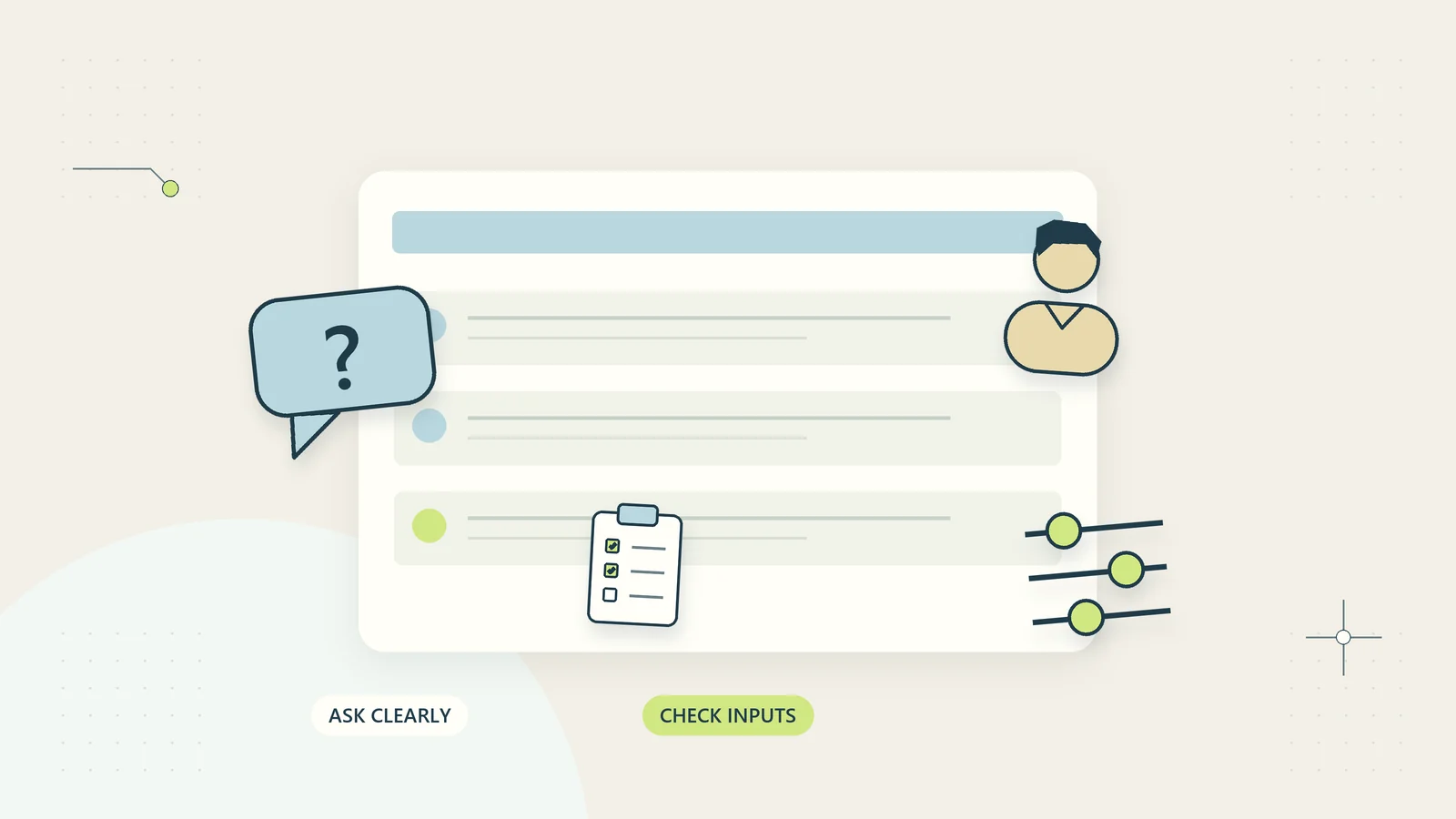
A client intake form should help someone explain the work they need and help your business decide the next useful step. Too often, it does neither. It asks for internal classifications the client does not understand, collects details nobody uses, and leaves the team to ask the important questions again by email.
Better intake starts with the decisions behind the questions. What must you know to route a request, recognize a poor fit, prepare the first response, or begin agreed work? Each answer should support one of those actions. Everything else can wait until there is a clear reason to request it.
This guide explains how to design intake questions for a service business, digital product business, or small operational team. The method is independent of any form provider. You can apply it to a first-party website form, a structured document, or a guided support flow, provided the resulting information reaches an owned process.
Define the next decision before writing questions
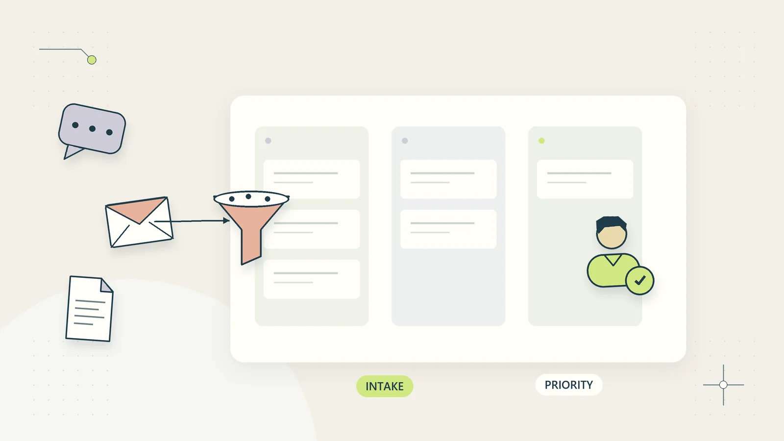
Decide what happens after submission. If the immediate result is a tailored self-service recommendation, ask only what changes that recommendation. If a team member must assess scope, identify the information needed for that assessment. If the person is already a client, avoid making them repeat information you already hold reliably.
Write the next decision in one sentence. For example: “Route the request to the correct service category and show the requester the relevant preparation checklist.” That sentence makes it easier to challenge a question about annual revenue, a full postal address, or an unrelated business profile.
Create a question inventory with four columns: question, decision supported, person who uses the answer, and consequence if the answer is missing. A question without a clear user or decision is a candidate for removal.
Your work intake process should define ownership and routing after the information arrives. A well-designed form cannot compensate for a queue that nobody checks or a service category that has no responsible owner.
Separate initial fit from detailed onboarding
Initial intake and onboarding are different stages. A visitor exploring a resource does not necessarily need to supply the same information as a client beginning a confidential engagement. Combining both stages creates an intimidating first interaction and can collect sensitive details before they are needed.
Use progressive information requests. Ask the minimum needed to provide the next useful result, then request further details when the person chooses a relevant path. Explain why later information matters and what action it enables.
For example, a hypothetical operations resource business initially asks about industry, recurring task, current difficulty, and preferred result. It can then offer a suitable checklist or planning worksheet. It does not need bank details, customer lists, or access credentials to make that recommendation.
If the person later buys a digital resource, payment information belongs in the appropriate checkout flow, not in the general intake narrative. Keep the purpose of each stage visible so visitors understand which action they are taking and what happens to the information they provide.
Replace internal terminology with observable questions
Clients may not know whether they need “workflow orchestration,” “accounts receivable optimization,” or “service operations transformation.” They can often answer questions about what currently happens: which task repeats, where work gets stuck, and what they have to chase.
Ask about the situation before asking the person to choose a technical solution. “What are you trying to make easier?” is usually more accessible than “Which automation architecture do you require?” Offer concrete examples without implying that those examples are the only valid answers.
Avoid questions that contain several different requests. “Describe your team, tools, budget, process, and desired timeline” produces uneven answers because people naturally focus on different parts. Separate the information where each part supports a distinct decision.
The GOV.UK question-page pattern emphasizes knowing why a question is needed and making its purpose clear. In a commercial intake flow, that means writing from the client’s available knowledge rather than from your internal database structure.
Choose the right answer format
Use structured choices when consistent answers genuinely help routing. Use free text when the person’s explanation contains meaning you cannot predict. A useful intake usually needs both, rather than a long list of dropdowns or an unrestricted essay box.
| Information needed | Practical format | Important limitation |
|---|---|---|
| Main type of work | Short list of plain-language options | Include a useful route when none fits |
| What is going wrong | Brief free-text question with an example | Avoid requesting confidential case details |
| Timing constraint | A specific date or broad timing choice | Distinguish a preference from a hard dependency |
| Current volume | A range or approximate number | Allow an honest unknown answer where valid |
| Existing customer reference | Short reference field when applicable | Do not use a public identifier as identity proof |
Do not force false precision. A client who has never measured weekly request volume may provide a more useful range than an invented exact number. Where uncertainty changes the recommendation, make that limitation visible in the result.
Explain what a useful answer looks like
A short example can prevent a vague response. For a process question, you might write: “For example: after a customer approves a quote, we manually copy their details into three records.” That explains the desired level of detail without asking the person to understand process-mapping terminology.
Examples should not become leading answers. If every example describes a problem solved by your most expensive product, the intake becomes a sales funnel disguised as assessment. Use examples from different situations and let the person describe a different need.
Tell people when an estimate is acceptable. If a rough volume is enough to choose a worksheet, say so. If a precise reference is essential to locate a transaction, explain where to find it and what to do when it is unavailable.
Connect the question to the result when useful: “This helps us choose a checklist for individual work or a team handoff.” That is more informative than a generic statement that every field “improves your experience.” The explanation should be specific enough to justify the request.
Make optional information genuinely optional
An optional label should mean the person can continue without answering. Avoid validation that rejects a blank optional field or an apparent preference question whose answer secretly determines whether the form submits.
Decide how missing information will be handled before publishing the form. A missing estimate might produce a general recommendation. A missing contact route might mean the person receives the result only on screen. Those are valid product decisions if they are explained clearly.
Do not mark every field required simply because a complete record looks tidy. Required fields should protect a necessary decision or action. If staff routinely ignore an answer, making it mandatory increases client effort without improving the work.
Also avoid requiring marketing consent to receive an operational result or purchased resource. Distinguish the contact information necessary for the requested service from a separate choice to receive promotional messages. The right legal wording depends on the circumstances and applicable requirements; the underlying information design should keep those purposes understandable.
Design for accessibility and recovery
People need to understand the questions, operate the controls, and recover from errors. W3C’s forms tutorial explains the role of accessible labels, related field groups, instructions, and feedback. Those foundations matter whether a form is processed on your own website or through another system.
Keep visible labels attached to their inputs. A placeholder that disappears as someone types is not a good substitute for a persistent question. Use a logical reading order, clear focus behavior, and controls that work with a keyboard.
When validation fails, explain the specific problem and how to correct it. Preserve answers that are already valid. “Something went wrong” leaves people guessing; “Enter a contact email address, such as name@example.com” gives them an action.
Test more than a successful desktop submission. Try a small screen, keyboard-only navigation, a missing required answer, a long company name, an unfamiliar international phone format, and a slow connection. If the form cannot preserve progress after an error, reduce its length or improve its recovery behavior before adding more questions.
Protect the intake from unnecessary sensitive information
Free-text questions invite people to include more detail than you need. State boundaries beside the relevant field: describe the administrative problem without sharing passwords, payment card information, confidential client documents, or private case details.
Consider whether an attachment is necessary at the first stage. A screenshot may contain customer names, financial figures, or private messages. If a written description is sufficient for routing, do not ask for an upload simply because the form can support one.
Keep the resulting record available only to the roles that need it. Define where the information goes, how long it remains useful, and how duplicate submissions are handled. Avoid emailing the full contents to multiple people when a controlled internal record is more appropriate.
Before adding data to an automated recommendation or AI step, use the same purpose test. Does that step need the original narrative, or can it work with a limited category and a non-sensitive summary? The customer data sharing checklist can help make those decisions explicit.
A hypothetical intake redesign
Imagine a small consultancy whose existing enquiry form asks for company size, revenue, preferred software, budget, complete project description, and an attachment. Many submissions still require a follow-up because the team cannot tell which recurring task the client wants to improve.
The team replaces the first stage with four questions: the type of business, the task causing difficulty, the main consequence, and what a useful improvement would look like. A short note asks people to avoid confidential customer information. A contact route is requested only if the visitor wants a written follow-up.
One visitor selects a property services business and describes maintenance requests arriving through several channels. The result points to a request-intake worksheet and explains that an urgent safety concern requires the business’s appropriate emergency route, not an ordinary administrative queue.
Another visitor describes repeated client document chasing. The result offers a document-request checklist and asks whether the problem is unclear requests, missing ownership, or inconsistent follow-up. That follow-up question belongs to the selected path rather than appearing on every visitor’s first screen.
The team does not claim that the revised flow qualifies every project automatically. It provides useful first-party guidance and makes unresolved uncertainty visible. More detailed onboarding can follow only when it serves an agreed next step.
Connect the answers to a clear result
Show what happened after submission. A confirmation should identify the received request or generated result, explain any next action, and state how the person can correct a mistake. Avoid a vague “Thank you” page that leaves them wondering whether they must contact you again.
If the result is immediate, make it usable without unnecessary delay. Provide the chosen checklist, explain why it was selected, and show any assumptions that limit its fit. Do not suggest that a short intake has produced a complete professional assessment.
If a person will review the request, name the expected process and a realistic response target. Only promise a deadline the business can support. The client onboarding checklist can then connect an accepted request to scope, responsibilities, and the first useful milestone.
Keep a reference that helps reconcile retries and duplicate submissions. A visitor pressing submit twice should not accidentally create two separate paid actions or several disconnected follow-up threads. The confirmation and internal record should describe the same event.
Make the form work across business contexts
A worldwide audience will not share one naming convention, address format, currency, or working week. Ask only for the parts of that information your next decision requires. A person exploring an administrative checklist may need to identify their broad industry, but not supply a postal code that fits a particular country’s pattern.
Keep names flexible where a full legal identity is not needed. A general enquiry can often use the person’s preferred name and contact route. If a later transaction requires a different identity record, collect it at the appropriate stage with a clear explanation.
State units beside quantitative questions. Ten requests per day and ten per month describe different workloads. A budget number without a currency is not a usable estimate. Where the intake cannot interpret a regional answer reliably, preserve the original meaning and ask a focused clarification instead of silently converting it.
Include these cases in the pilot. A form can pass its standard demonstration while failing for an international name, an unfamiliar date format, or a business that operates outside the categories its creator expected.
Test question quality with real decisions
Run a small pilot using representative scenarios. Include a straightforward request, a poor fit, an uncertain volume, a person who does not know their software names, and someone whose need falls between categories. Check whether the flow still produces an appropriate result.
Measure completion problems and operational usefulness separately. A shorter form may complete more easily while producing answers that cannot support routing. A detailed form may look informative while causing staff to ask all the same questions again.
Useful pilot measures include questions skipped, validation errors, clarification requests, incorrect routing, duplicate records, and time spent preparing the next useful action. Review a sample of actual answers with appropriate privacy controls and remove questions that do not earn their place.
Maintain a question owner and review date. Services change, so the reason for collecting a field can disappear. A strong intake flow stays small because someone keeps asking whether each question still helps the client and the business move forward.
Sources and editorial method
Research checked October 15, 2026. Design background comes from the GOV.UK Design System question-page pattern and W3C’s accessible forms tutorial. These sources inform question clarity and accessibility; this article does not claim that following a short checklist establishes complete legal or accessibility compliance. The decision inventory, format table, first-party result design, and consultancy scenario are original practical analysis. The example is hypothetical and does not report measured conversion or customer outcomes.